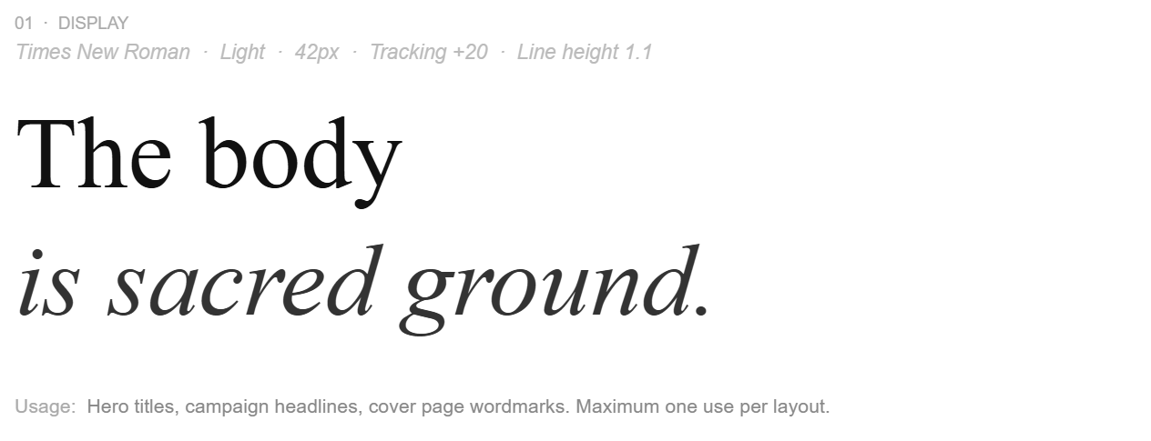
Auric: A Sacred Fashion Brand System
A speculative sustainable fashion house built at the intersection of spiritual practice, editorial restraint, and conscious material culture. Designed for people who understand that how something is made is inseparable from what it means.
Role: Brand concept · Creative direction · Design system · Campaign art direction
Scope: Brand identity · Color + type system · Campaign · Multi-channel formats
Tools: Illustrator · Photoshop · Midjourney
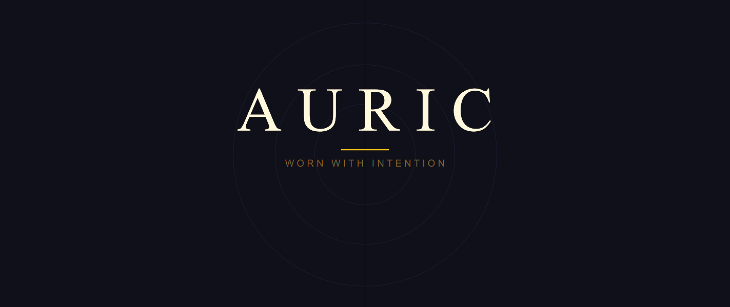
Wordmark & Logo System
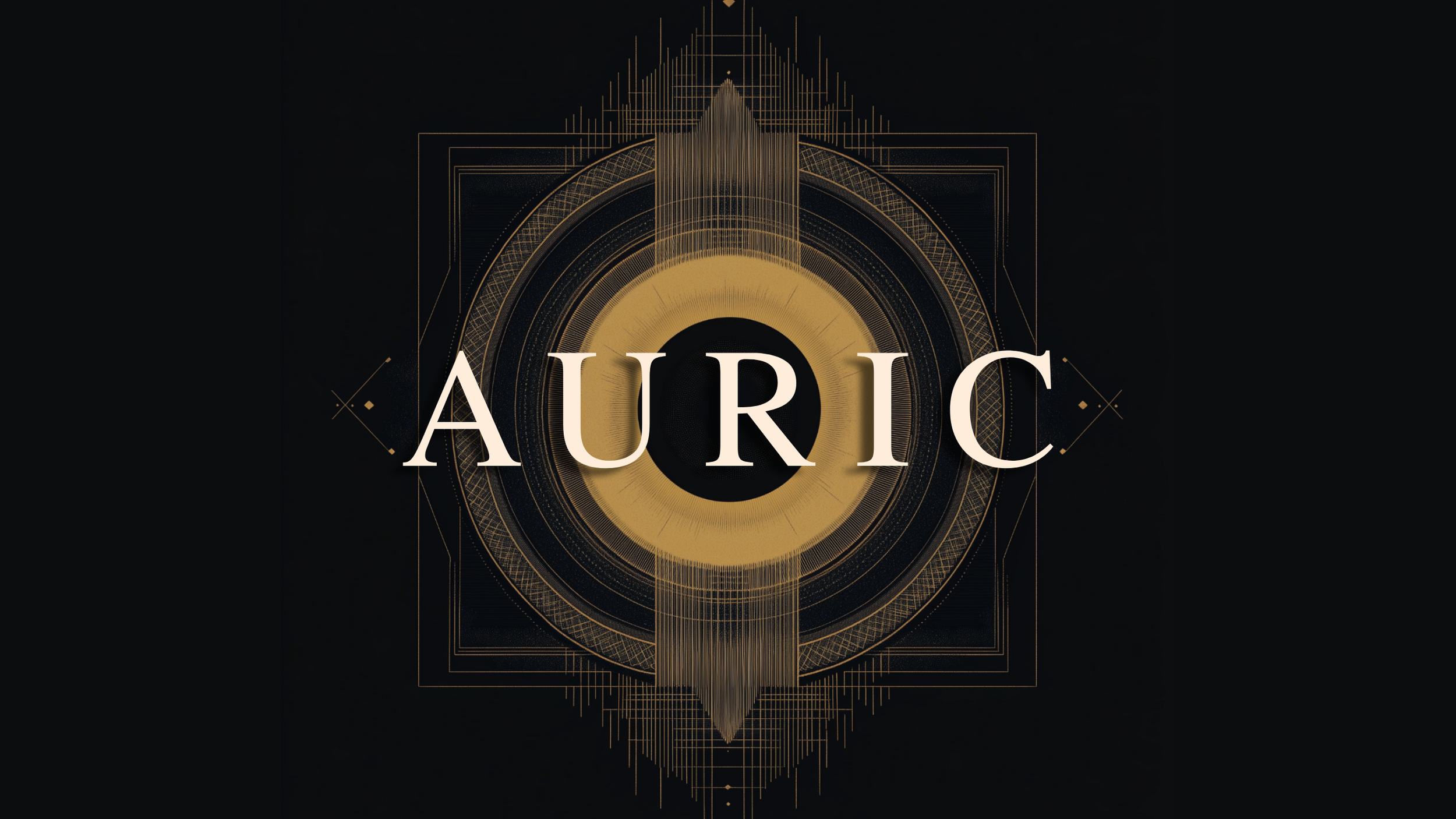
The hero mockup — wordmark centered on void ground with woven thread in patterns of sacred geometry. This is the brand's primary statement.

Primary - Light on Dark
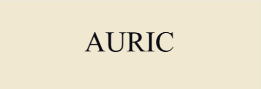
Reversed - Dark on Light

Gilt - Ceremonial
The wordmark is set in a refined serif at generous tracking. Three applications ensure the brand travels across all surface types — packaging, digital, and environmental — without losing identity.
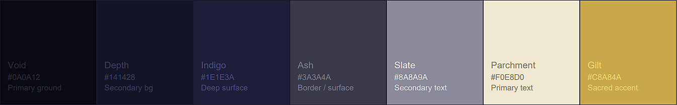
The Palette of the Sacred
Typography - Ancient Weight, Modern Clarity
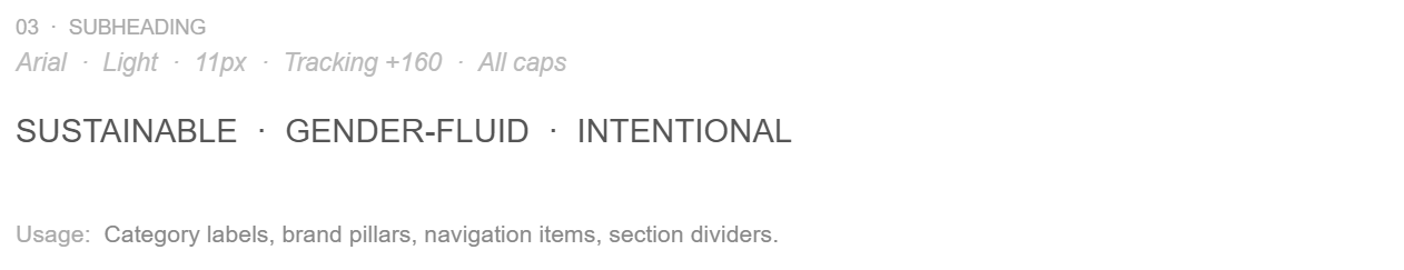
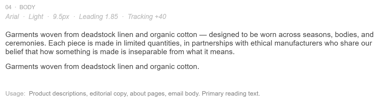
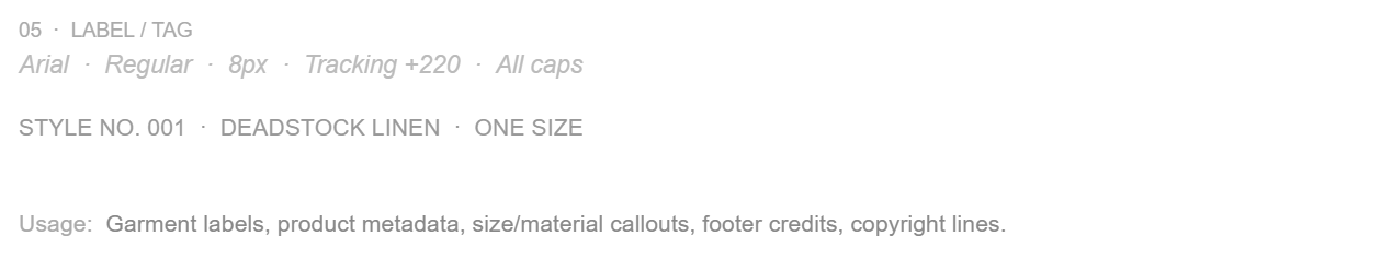
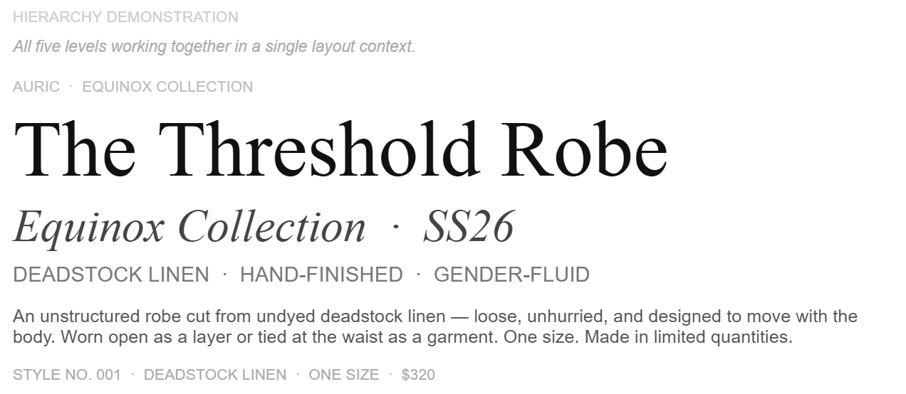
Two typefaces. Five levels. One visual logic. The serif carries emotional weight and heritage. The sans handles clarity and function. They never compete because they never appear at the same scale.
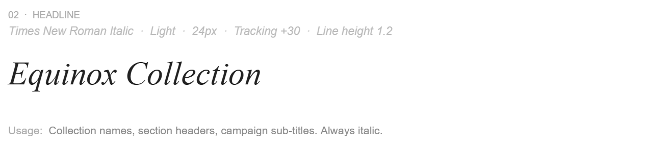
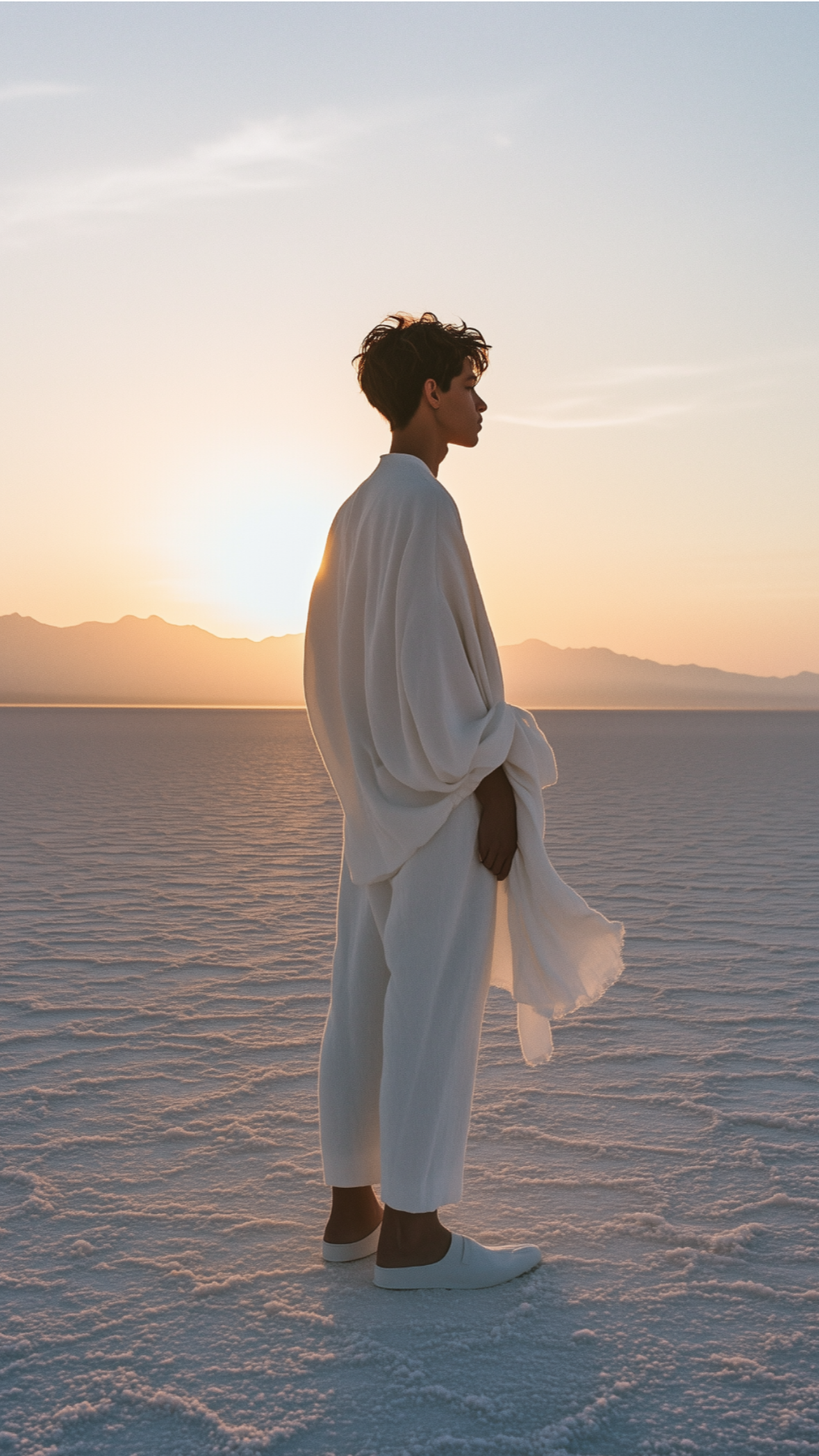
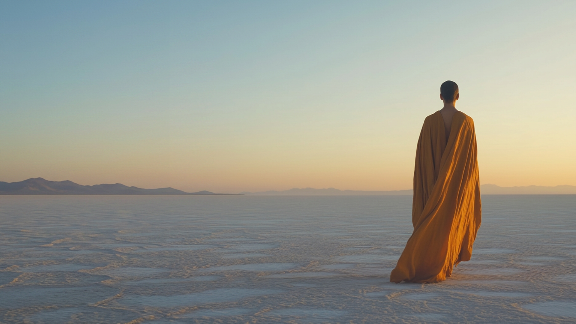
Equinox - The Debut Collection
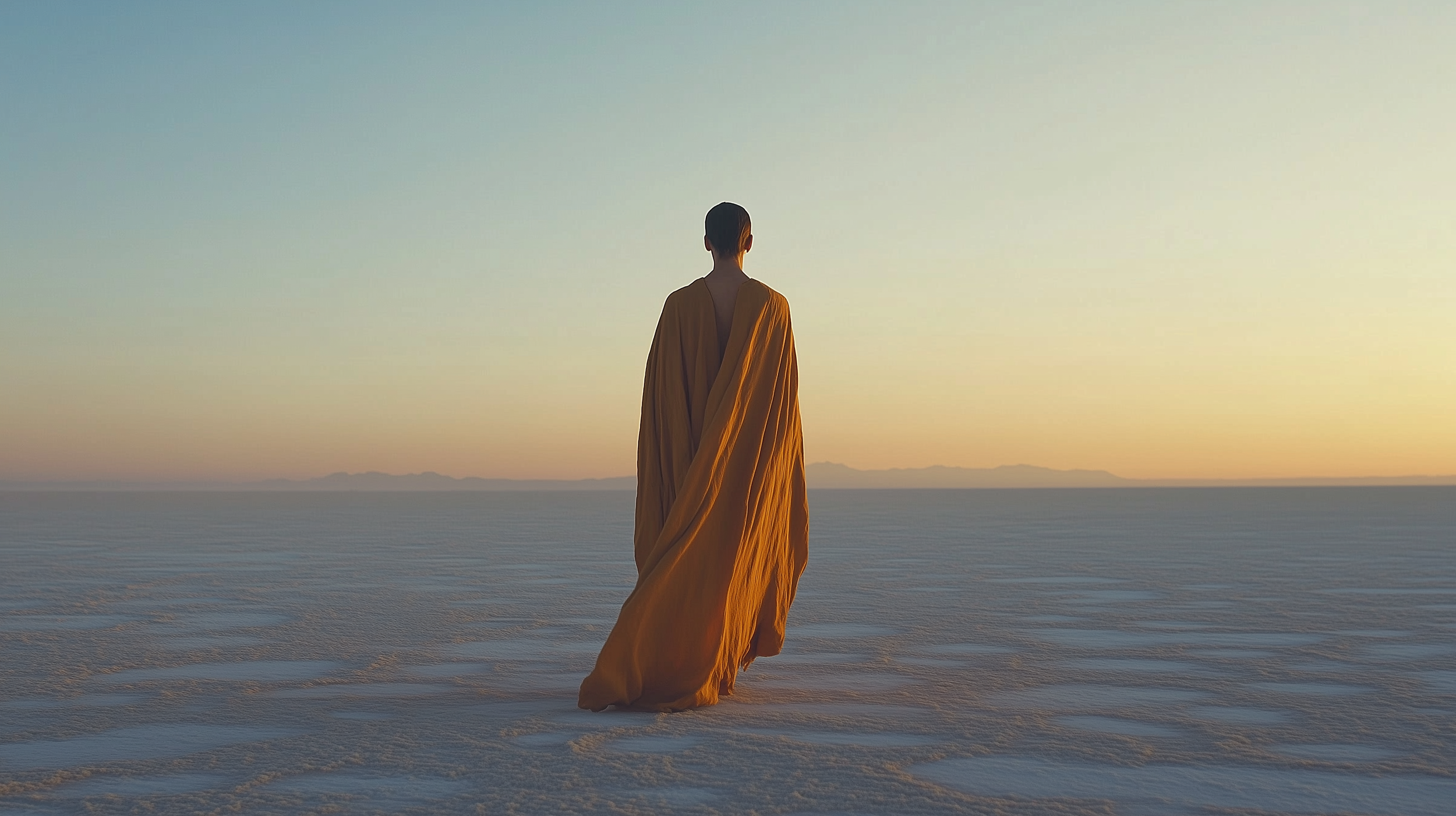
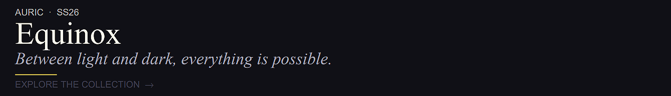
The campaign is built on restraint — one body, one garment, one landscape. The light does everything the copy doesn't.
The Campaign Across Touchpoints
Story Post: 9×16
1080 × 1920px
Paid Media: 728 × 90
Display Leaderboard Banner
Social Post: 1×1
1080 × 1080px
Email Banner: 16×9
1440px wide landing section
600 × 200px
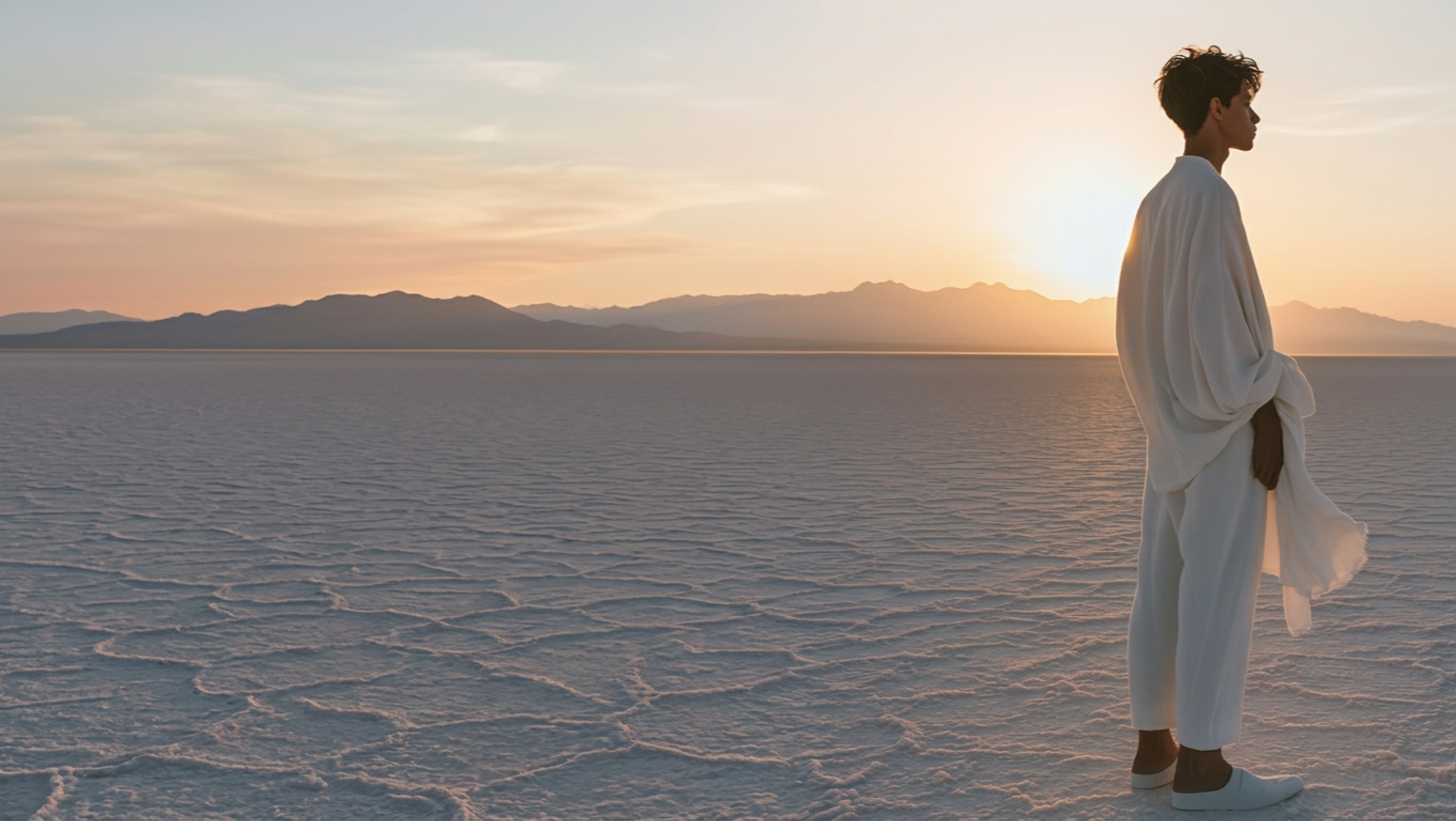
Web Hero - Desktop

Five formats, one visual logic. The campaign adapts to each channel context without losing the register established by the hero image.
Design POV
Auric started as a question: what does a fashion brand look like when it takes spiritual practice as seriously as sustainability? The answer turned out to be restraint — not minimalism for its own sake, but the visual equivalent of silence before ceremony. Every element earns its place, or it disappears. Designing a complete brand system from identity through campaign through packaging revealed how every decision is downstream of the founding premise. Get the premise right and the palette, the type, the hierarchy, the formats — they follow.