Digital Campaign Design
Beauty and wellness products are invisible on screen — you cannot smell, feel, or touch them through a banner or a feed. Digital campaign design for these categories is entirely a problem of sensory translation: how do you make someone feel a fragrance, a texture, a ritual, through hierarchy, color, and composition alone?
Across multiple brands, I developed and adapted digital campaign assets spanning the full spectrum — from ultra-luxury editorial to accessible consumer wellness — each demanding a distinct visual grammar while maintaining production consistency across the system.
Multi-brand digital campaign design spanning the full spectrum - from luxury restraint to accessible wellness
Scope - Digital campaign asset development, multi-brand visual systems
Tools - Photoshop · Illustrator · After Effects
Tom Ford
The Spectrum:
Balmain
Jo Malone
Aramis
Peach & Lily
Peach Slices
01
TOM FORD BEAUTY / OUD WOOD
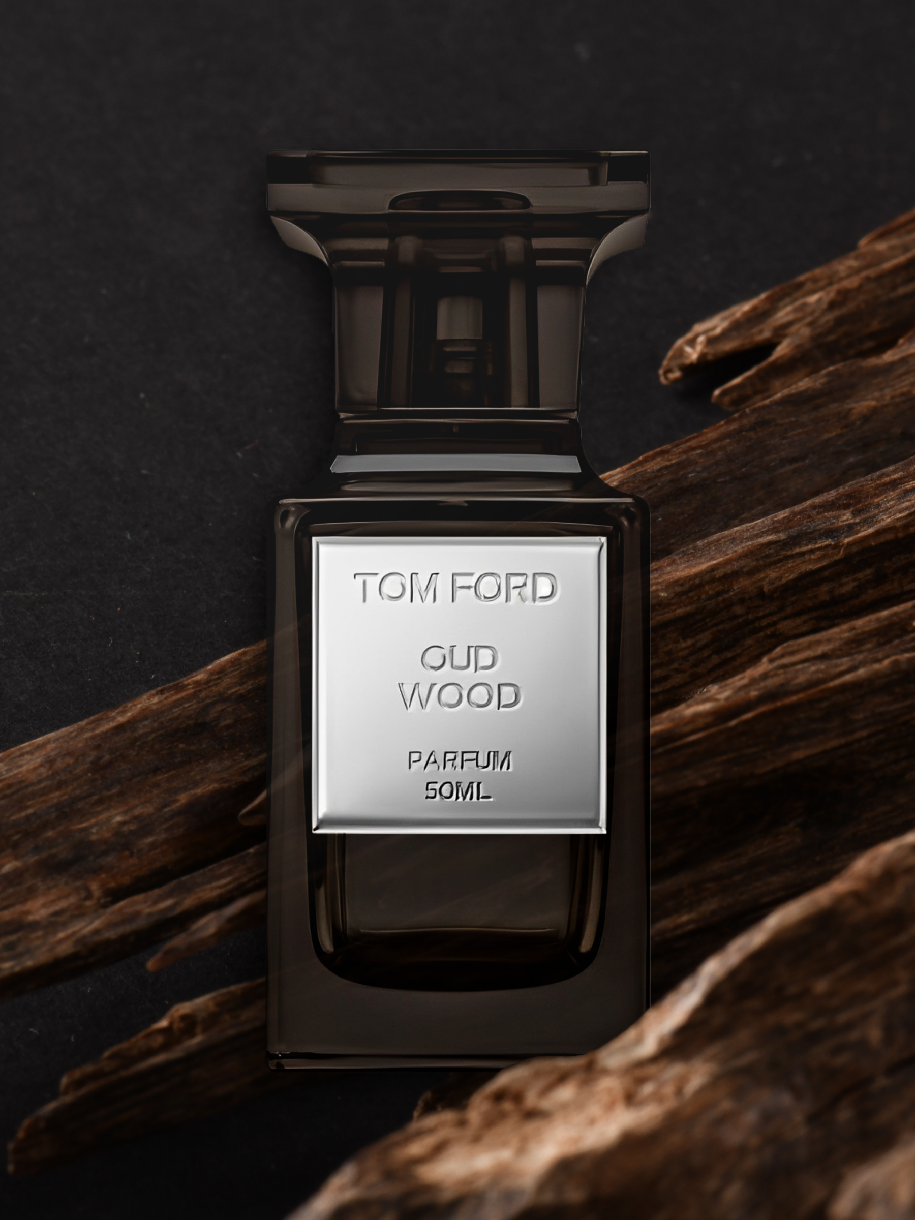
Editorial Restraint
Near-black ground. A single product. No explanation needed. The design decision here is what's removed — negative space does the luxury signaling so the product doesn't have to. Typography is minimal and load-bearing. Every element earns its placement.
02
BALMAIN / CARBONE

Dramatic Contrast
Where Tom Ford withholds, Balmain performs. Deep cobalt, smoke, a red rose — the visual language is theatrical and unapologetic. The challenge was honoring the fashion house's identity without letting the drama overwhelm the product hierarchy. Bold wordmark placement anchors the composition against high visual noise.
03
JO MALONE LONDON / FRANGIPANI FLOWER
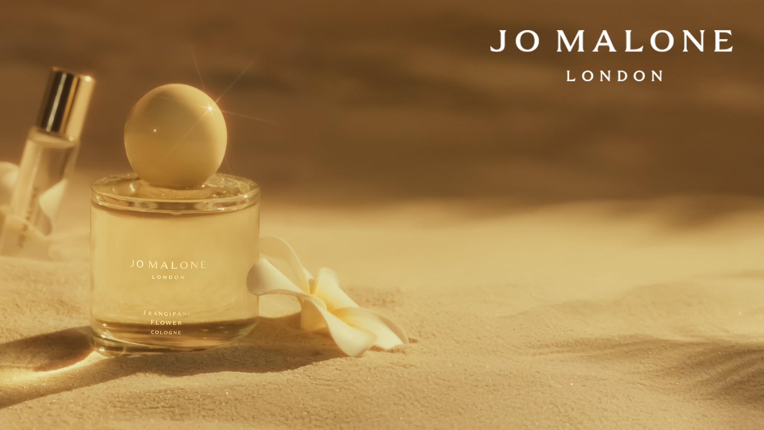
Sensory Warmth
Sand, soft light, a single bloom. Jo Malone's brand world is built on memory and atmosphere — the digital translation has to evoke scent through texture and warmth rather than through drama. Lower contrast, horizontal breathing room, and a muted palette create a pace that slows the scroll.
04
ARAMIS / INTUITION

Emotional Gradient
A dusk-to-dawn gradient carrying the weight of the campaign narrative — transition, possibility, the moment between. This asset bridges the luxury and accessible registers: more emotive than Tom Ford, more narrative than Balmain. Lavender and citrus as color language, not just prop styling.
05
PEACH & LILY / BRIGHTENING RITUAL

Accessible Wellness
The visual grammar shifts entirely here. Soft pedestals, natural light, a rainbow refraction — approachability replaces aspiration. The design priority moves from mood to clarity: ingredient hierarchy, product legibility, and a warmth that invites rather than impresses. This is the register where healthcare and wellness brands most often live.
06
PEACH SLICES / SNAIL RESCUE SERUM

Playful & Functional
Illustration, a clinical cross, botanical elements — this is a brand designed to make active skincare feel joyful rather than prescriptive. The design challenge is holding playfulness and functional credibility simultaneously without either canceling the other out. Clean white label. Green ground. Legibility over mood.
Format Systems
Two brands from this portfolio were developed into full format systems: one from the luxury end of the spectrum, one from the wellness end. The decision was intentional. These two registers represent the widest distance in the range. Each system covers three formats: a 1:1 social post, a 9:16 story, and a 600px email banner. The constraints are different in each. So are the decisions.
Format System 01
TOM FORD BEAUTY
Editorial restraint held across three channel formats
Social 1:1
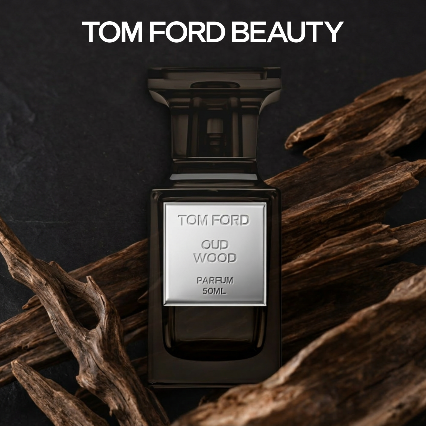
1080 × 1080px
Centered composition. Maximum breathing room on all four sides — the square format rewards the restraint.
Story 9:16
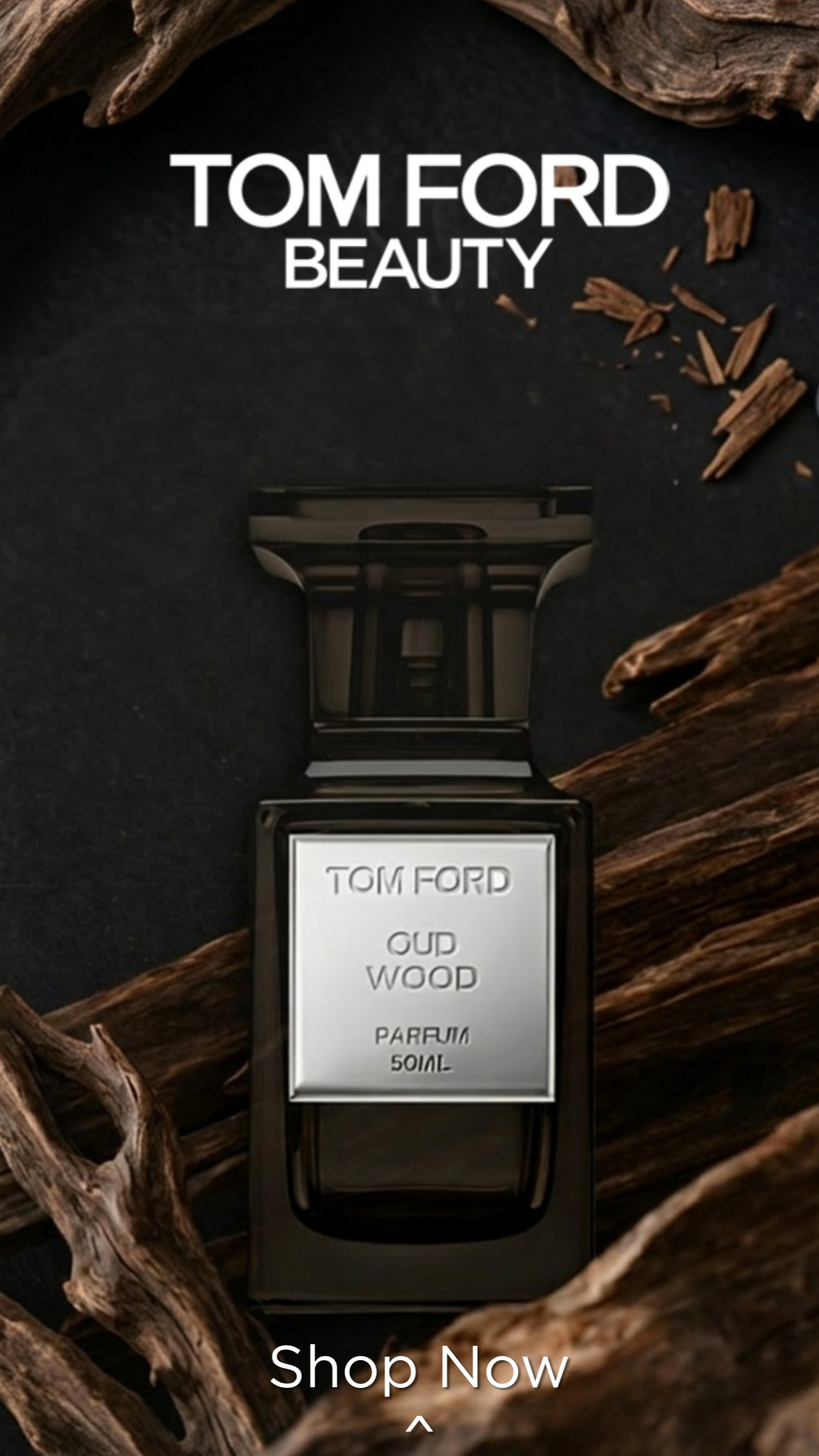
1080 × 1920px
Vertical format demands a clear top-to-bottom hierarchy. Brand mark leads, product anchors center, CTA sits at base.
Email Banner - 600px
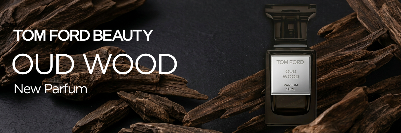
600 × 200px
Horizontal format splits copy and product into left/right zones. Typography left-aligns to allow the product to breathe on the right. The dark ground travels across all three formats without adjustment.
Format System 02
PEACH & LILY
Accessible wellness translated across digital touchpoints
Social 1:1
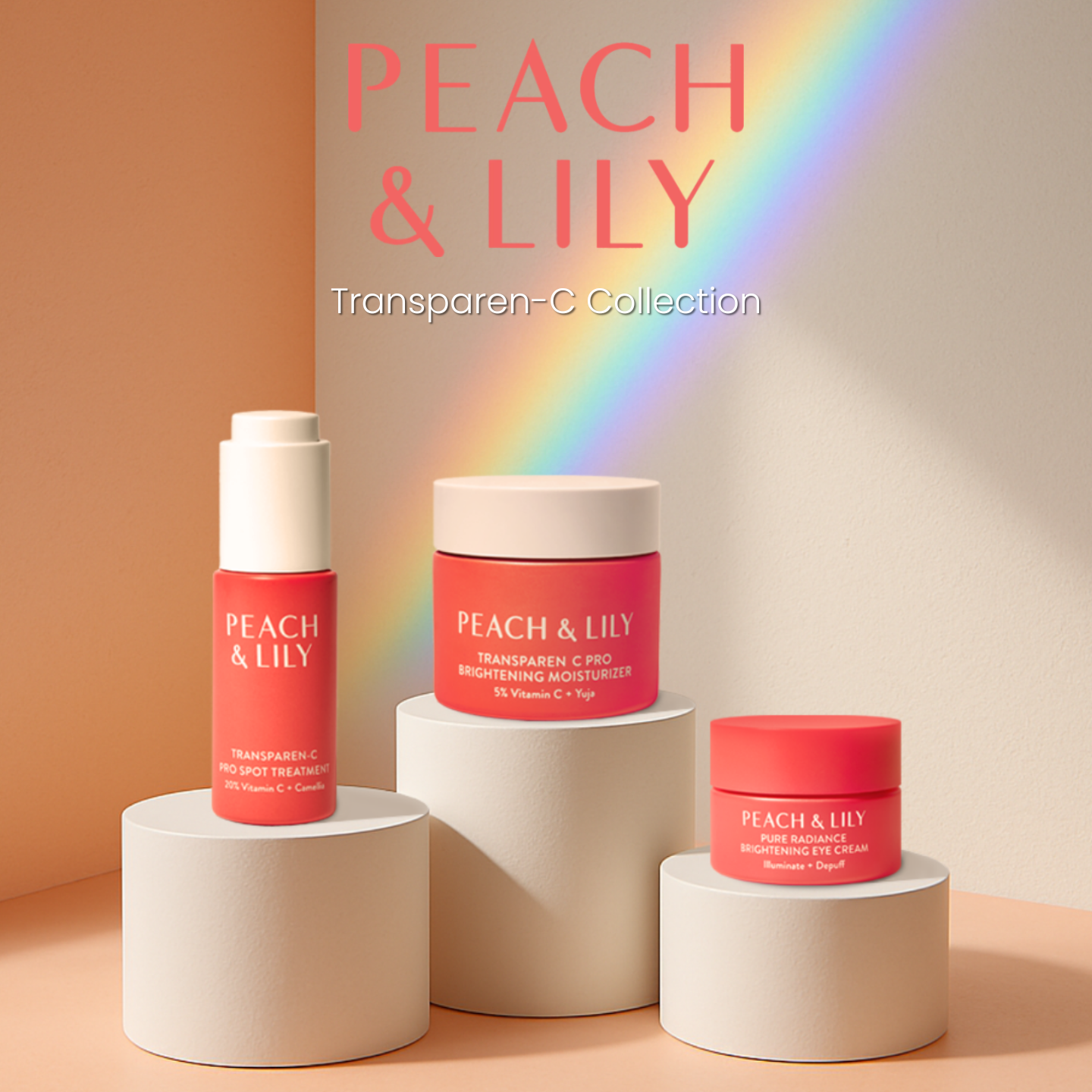
1080 × 1080px
Product trio on implied pedestals. Warm ground, centered hierarchy. Ingredient name leads as campaign headline — approachability over aspiration.
Story 9:16
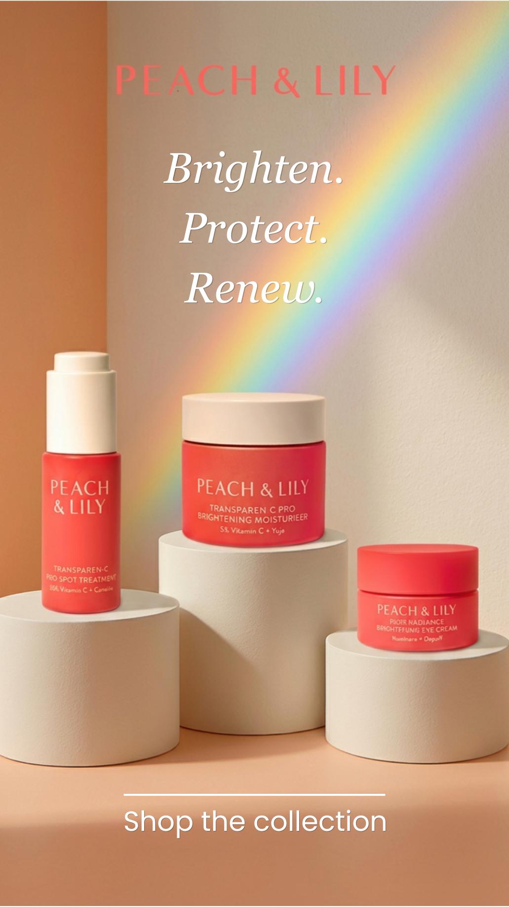
1080 × 1920px
Benefit language stacked vertically as the campaign hook. Story format rewards bold editorial copy — the warm palette softens what could otherwise feel clinical.
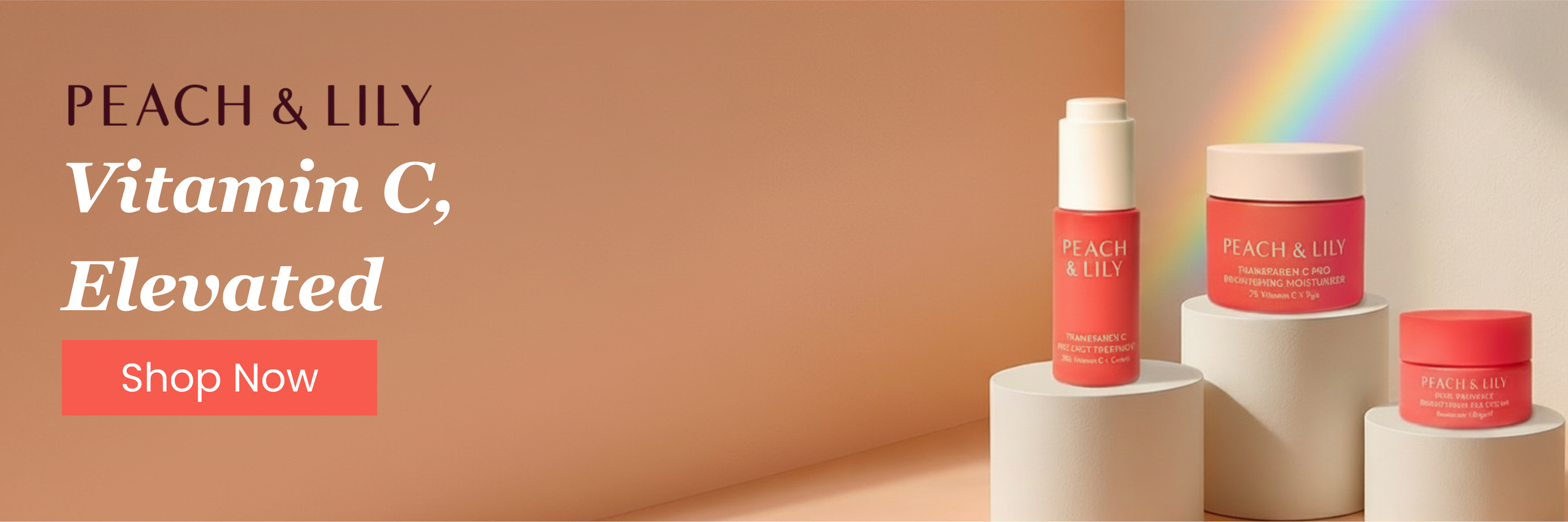
Email Banner - 600px
600 × 200px
Email format introduces a CTA button — the only format where direct conversion language is appropriate. Copy shifts from atmospheric to benefit-led. Warmth is maintained through palette, not just imagery.
Design POV
Designing across this range revealed a consistent truth: the most important decision in digital campaign design is register. Before layout, before color, before type — you have to know where on the emotional spectrum this brand needs to land for its audience at this moment.